NYC Parks: Website Redesign
Revamping and modernizing the NYC Parks website for better public accessibility and usability
Team
Yeatasmin, Nehal, Sagar, Shuyang, Sanjana
Tools:
Figma, Google Suite, Miro, Optimal Workshop
Timeline:
16 weeks
Role:
UX Design, User Research, UI Design, Prototyping

overview
NYC Parks has a website that hosts a plethora of content ranging from park locations to events to volunteering. Our team got together to redesign the website to create a modern and user-friendly space. This will help improve public accessibility of information relating to the city’s parks. Through a revamped navigation system and modern user interface, our newly designed website encourages both New Yorkers and tourists to explore the city’s parks and its many offerings.
the process
users
research
wireframes + user testing
We first conducted a survey with questions about people’s experiences with the city parks, the website, and social media. With 16 respondents, we were able to conduct interviews to understand their physical wants in parks, online presence, and observe them navigating through the website. After compiling our notes with an affinity diagram, 4 key insights emerged.
Desktop
Problems revealed
1 Participants prefer to go to parks for relaxation, nature, and events.
2 An accessible schedule of events would be a convenient way for everyone to keep up with NYC Parks and the website.
3 There is a preference for using social media over the NYC Parks website.
4 Participants prefer a website that is more updated and modern.
“It’s hard to find what I’m looking for”
“The website seems outdated”
Mobile
It’s the weekend and you’re looking for a movie screening for you and your friends to go to, where would you go to find the screening?
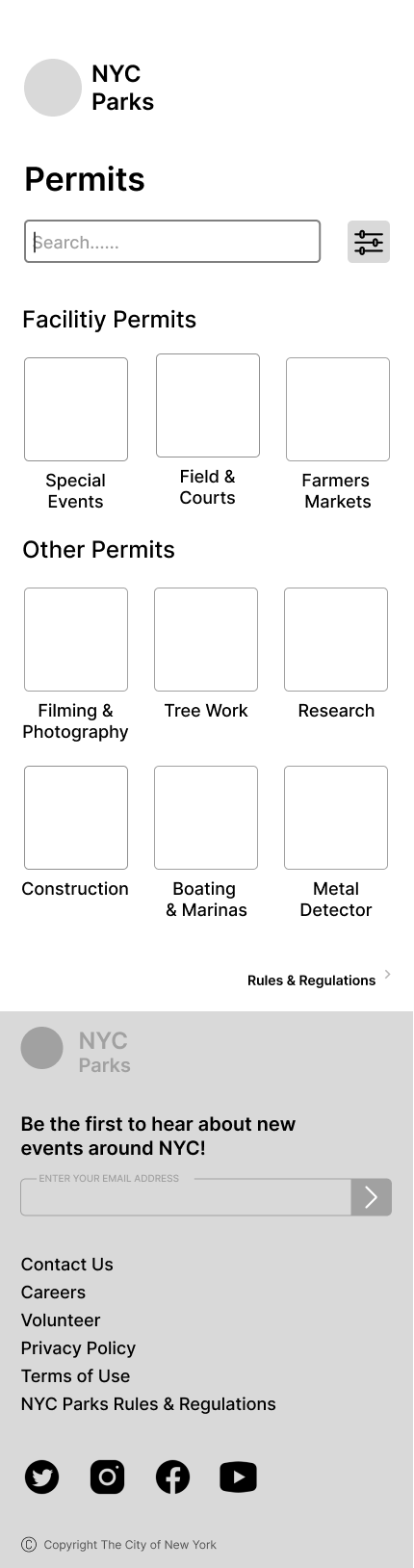
Apply for a permit for a film and photography shoot.
The search button for the Calendar drop-down seems redundant.
With these insights, we created a site map of the information architecture for our redesigned website. We implemented this IA into our wireframes and final designs.
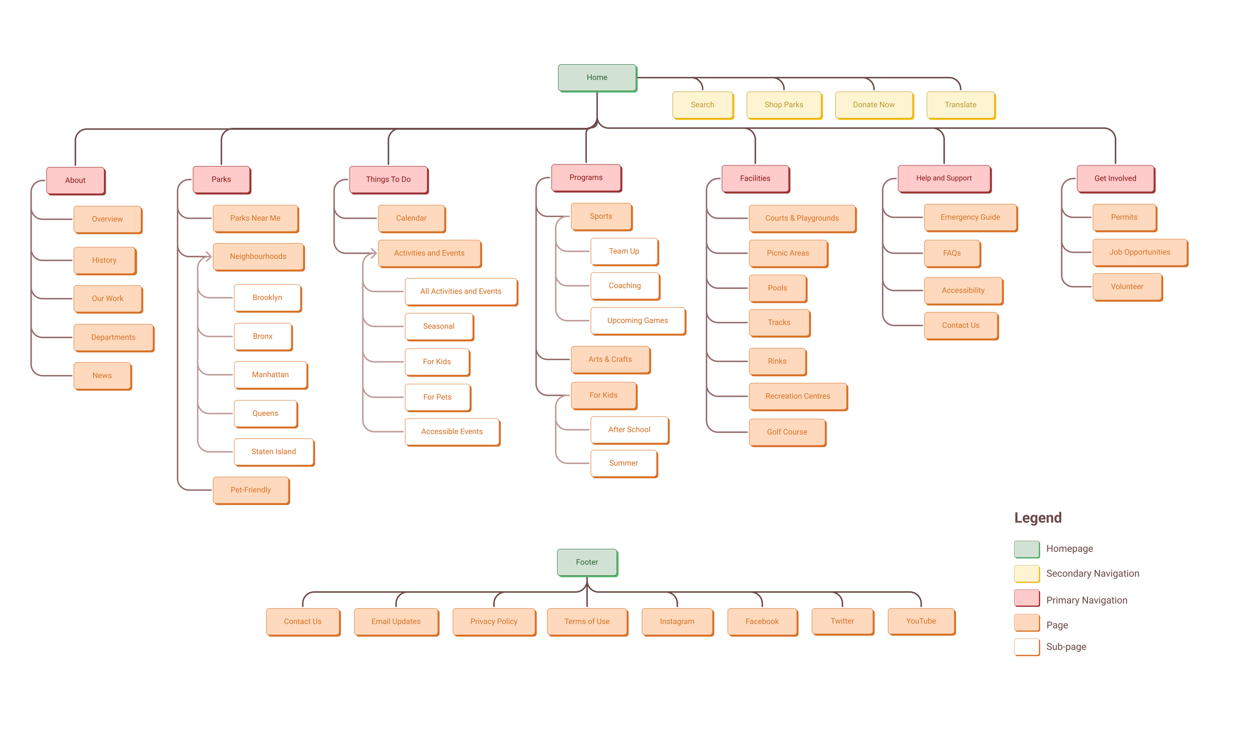
Through competitive reviews, card sorting, and a tree-testing study, we redefined the website’s information architecture and gained some more insights on user navigation.
We as a team started on wire framing based on our research and made screens for flows and pages that our target user could explore. These wireframes were tested with the same interviewees.
Home

Calendar of Events

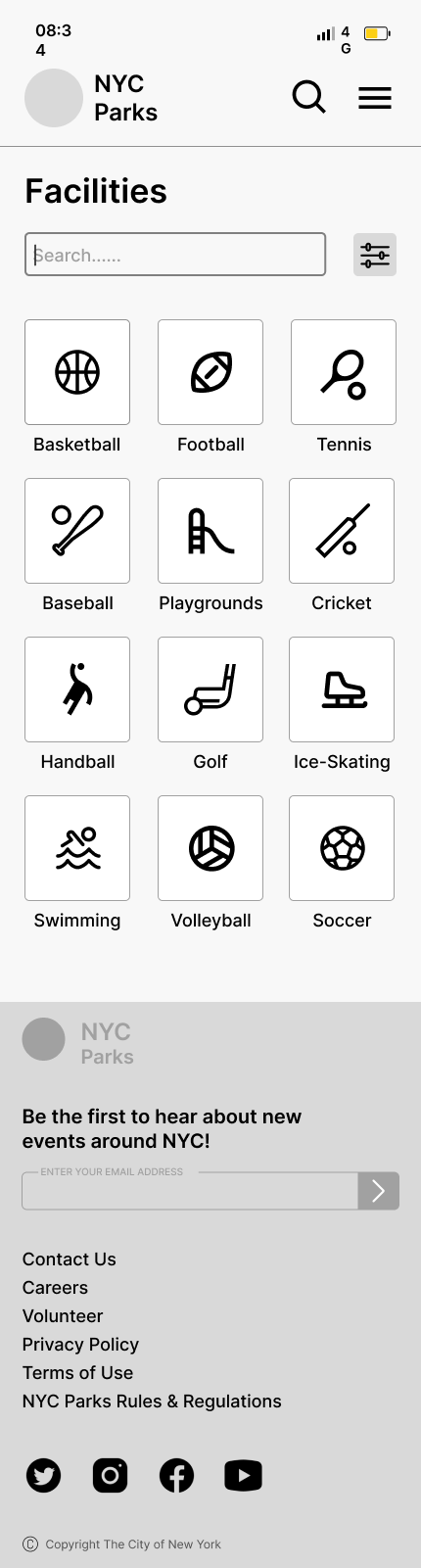
Facilities

Finding a Court


Permits
We tested the wireframes with the same participants that were interviewed. We had scenarios for both desktop and mobile for the users to explore:
It’s the weekend and you’re looking for a movie screening for you and your friends to go to, where would you go to find the screening?
You and your friends want to play basketball together, where would you go to find a court?

With this information, we identified our target users as people ages 18-28 who are interested in events and activities. Then, we created our persona Anna, and her user journey based off the initial user testing of the website.


1 Participants had difficulty differentiating between “Activities” and “Events”.
2 Participants struggled with differentiating “Courts” and “Playgrounds” for the sports-related task.
3 Participants can distinguish between “Things to Do” [Activities and Events] and “Programs”.
4 Putting “Volunteer” under “Get involved” makes the most sense for the user.
The big banner on the main page of Facilities takes up space and seems unnecessary.
The wording of the primary navigation bar confuses participants: labeling doesn’t match their expectations.
final prototype
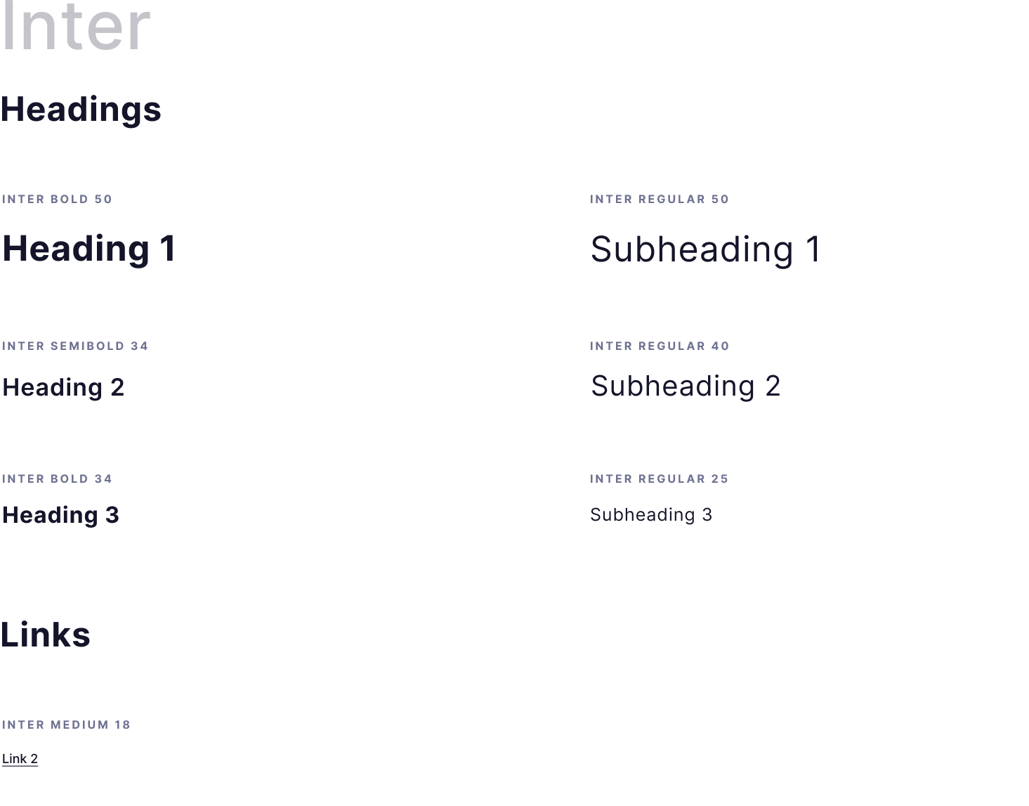
Based on feedback from user testing, we refined the problem areas and created our high-fidelity prototypes, paired with a new design system to better reflect and modernize the appearance of NYC Parks.

Play with the prototype below or click on the buttons to view!